
In terms of 35mm film there are some general preferences in terms of what stock you use to shoot certain things For example, Ektar is often used to landscapes and cityscapes, while Portra is a favourite for portraits; these are by no means set in stone but I will always have in my mind what stock I want depending on each situation.
Hence, when I knew I was headed for the bright lights of Wilderness Festival, I picked up 3 rolls of LomoChrome Purple to test out. I read up as much as I could on the film beforehand and found most people comparing it to Kodak Aerochrome, an old infrared-sensitive film developed for government surveillance. It has a really interesting back story as to why it came about and how it was used to pick out camouflaged buildings but, in terms of shooting it, the main thing I took away was ‘use a yellow filter’. The idea behind this being, as it is a colour reversal film, the yellow would push the colours towards the IR of the spectrum to produce more of a ‘pop’.
If I have one piece of advice it would be this: don’t use a yellow filter. I used a Tiffen Deep Yellow 15 filter and it’s wild. You completely lose the effect of the film as it is completely washed with purple. I foolishly only took 1 photo without the filter, just for comparison, meaning the other 35 photos on that roll are not what they should be. It still gives a powerful effect but not what I was expecting. You can see how the yellow filter washes the whole image purple, ruining any real colour contrast or impact from the colour reversal:


I think the reason for the filter with the Aerochrome but not with Lomographies stock is because they are developed differently; the new Lomography stock is standard colour C-41 colour so can be developed anywhere rather than specific E-6.

 I only managed to shoot 1 roll of LomoChrome Purple at Wilderness, you can read more about it and see the photos I managed to salvage here (Wilderness). But I did then take it with me when Natalie and I went to Belgium. This time I was much more organised in my testing and shooting, meaning not only was I much happier with the shots I got, but I now understand the film better having noted down the changes in ISO, exposure, light conditions etc.

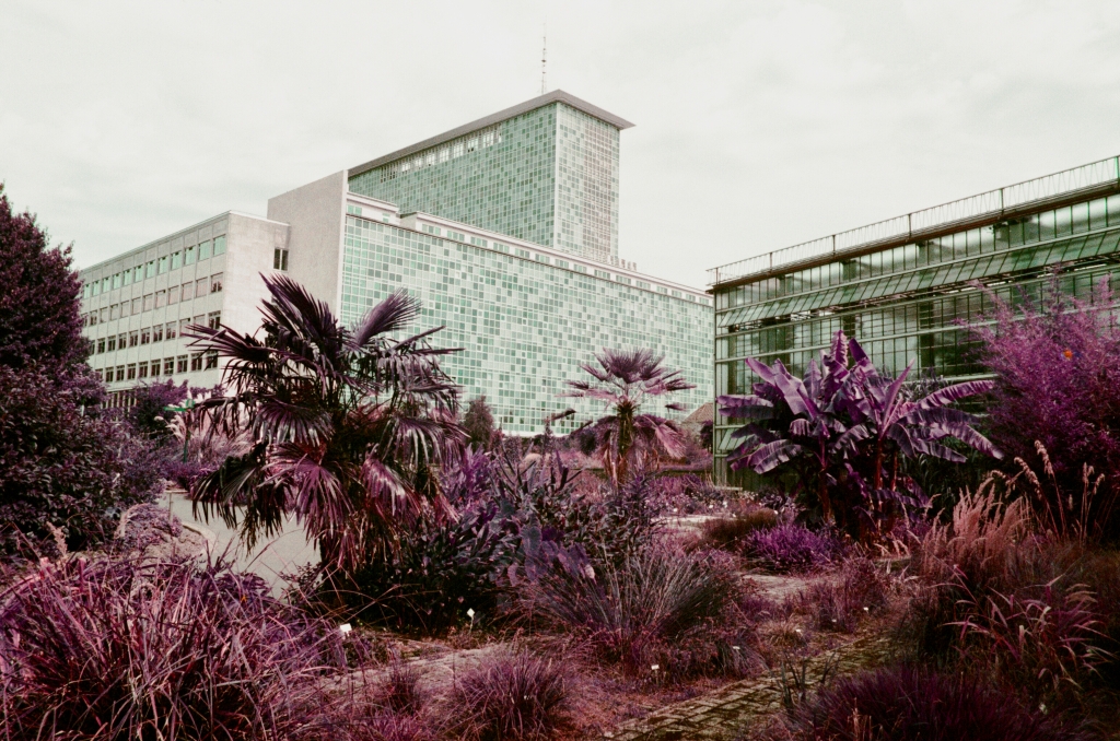
The Lomo Purple can be rated between 100-400 ISO with the website stating “Green tones will become a shiny purple when you use an ISO 100 setting, but with an ISO 400 setting greens will instead become a darker indigo”. I found this to be mostly true with the main important component being direct sunlight. Because you’re opening the film to infra-red, you need direct sunlight to give you the true colours and affect the film is capable of.


As with all stock, you have to try and test it yourself to get what you want from it. I really like this film for turning the everyday into psychedelic art, anything that changes the way you think and see the world is always a winner with me.

Leave a comment